
巻白 HAKU MAKI (1924-2000)
Surviving the Pacific War—where he was drafted into a Kamikaze “Special Attack Unit” (特別攻撃隊) - Haku Maki’s printmaking emerged in the mid-late 1950s, shaped by Japan’s post-war rebirth under Onchi Koshiro (1891-1955). Amid widespread reform, American proponents like James Michener and Ann Brannen championed the sosaku-hanga movement, paving Maki’s path to success through works such as The Modern Japanese Print: An Appreciation and Festive Wine: Ancient Japanese Poems from the Kinkafu.
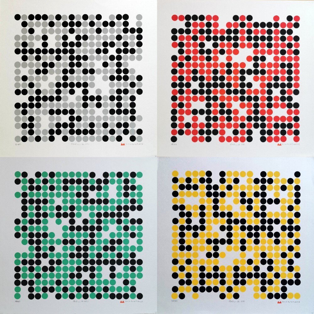
Daniel Tretiak, the leading authority on Maki, has extensively documented his oeuvre in The Life and Works of Haku Maki, analyzing signature compositional elements—coined “Splashes,” “Suns,” and the bold “Big Blues/Reds/Greens/Yellows.” His research has helped unearth a deeper appreciation for Maki’s evolving design language.
From early kanji-based forms to his defining Poem, Persimmon, and Collection series, Maki’s work draws from Chinese and Japanese culture, offering an intelligent and nuanced exploration of heritage, tradition, and the passage of time.


BIOGRAPHY WRITTEN IN ACKNOWLEDGEMENT, SUMMARY, & THANKS TO THE WORK OF DANIEL TRETIAK: THE WORLD’S AUTHORITY ON HAKU MAKI & THE AUTHOR TO: THE LIFE & WORKS OF HAKU MAKI, TOGETHER WITH HIS MANY RESEARCH NOTES.
Artist Biography:
HAKU MAKI - KOSHIRO ONCHI + POST WAR REVIVAL.
Maki’s path as an artist emerged from a post-war revival in Japanese printmaking. Japan’s art communities were left shattered following the end of the Pacific War. It’s military forces, including Maki, were still slowly returning to civilian population; the demand for political propaganda material had collapsed; printmaking materials were scarce; Japan’s economy was in ruin; and there was overall huge uncertainty around the future direction of shin-hanga & the emerging sosaku-hanga movements.
Despite this however, America’s occupation of Japan freed artists from the more traditional practices of the past which were anchored by a sense of nationalism & media censorship during the war. Bringing freedom for artists to explore new foreign markets, mediums, & art influence; occupying forces, along with keen American advocates in support of the creative-print movement (such as William Hartnett, Ernst Hacker, Oliver Statler, & James Michener), brought exposure to new foreign buyers. Together with the guidance from one of Japan’s most revered domestic artists of the period, Onchi Koshiro (1891-1955), the demand for modern Japanese prints began to slowly reignite.
Onchi was arguably the greatest contributor and catalyst for the rebirth of Japanese printmaking. Establishing the roots of the creative-print/sosaku hanga movement, Onchi helped artists navigate the difficult inter-war & post-war period: founding the First Thursday Society (一木会) in 1939 - a forum for a relatively small, but now renowned group of artists to meet, which included names such as Umetaro Azechi (1902-1999), Kiyoshi Saito (1907-1997), and Gen Yamaguchi (1896-1976). Concluding around 1950, a few years before Maki’s foray into printmaking had really begun: it was likely too early for Maki to have been an active contributor in Onchi’s society, having returned to his teaching career in Asomachi at the time. Nonetheless, the society had helped rejuvenate Japan’s art communities, re-establishing a support for a new and evolving generation of Japanese printmakers.
Onchi’s efforts and guidance ultimately lay the perfect foundation and stable ecosystem for Maki and his contemporaries to begin experimenting with their printmaking. Inspired, Maki quickly set about pursuing the artist’s path, and despite no formal art education, soon began to attend the Modern Print Study Society - a society founded by Onchi and Fumio Kitaoka (1918-2007) in 1950.
HAKU MAKI’S EARLY PRINTING.
Whilst it is unclear how much direct contact Haku Maki had with Onchi, his very early printmaking began in the mid-late 1950’s. Adopting his now referred to art pseudonym “Haku Maki” (formally Maejima Tadaaki), Maki took Onchi’s abstraction as a basis to freely experiment with an initial mix of katakana, kanji, and calligraphy forms.
Maki’s approach however, whilst abstract to the eye & despite the guise of his often modest manner, was deeply considered. Such so, Maki was more than just a printmaker. For the manner in which Maki ultimately constructed his images, he was a skilled carver and calligrapher. As Robert Craft details in a research note dedicated to Daniel Tretiak’s Tretiak Collection: Maki had a distinct appreciation for seal carvers - referencing an ancient form of Chinese script called “Seal script” from renowned Chinese seal carvers/calligraphers. Reflecting a primitive, yet abstractly modern feel to his pieces, Maki’s broad printing expertise & considered reference to seal script & text originating from ancient China/Chinese dynasty, is perhaps, particularly underappreciated. Nonetheless, Haku Maki’s work during these initial few years served as the source for the future refinement of successful calligraphy/kanji themed forms/elements present throughout his entire collective body of work.
Maki’s early work can typically be identified by: his primary adoption of woodblock printing & omission of any relief/embossing; his use of unrefined seal script/calligraphy forms to balance his compositions; his primary use of tonal & black and white colour; and the omission of his - soon to be introduced - recognised title cataloguing system. Prints were often of smaller series, standalone titled pieces, and printed on thinner, single sheet papers.
(~1957- early 1960) Examples include: Symbol (a series of (4?) closely clustered seal forms); Remembrance; Verses of god; and both untitled & titled geometric compositions which introduced Maki’s first “Work” series of prints - the first of a large & successful title which was predominantly developed through its reintroduction in the 1970’s/80’s
MAKI’S PRINTING THROUGH THE MID-LATE 1960’S.
Maki’s images remained distinctly abstract, but by the mid-late 1960’s he had begun to: introduce colour and vibrancy to his designs; print with thicker laminated/double sheet torinoko & shin-torinoko paper (allowing for the introduction of his unique & admired cement relief/embossed methodology); and he had begun to introduce a cataloguing system for his pieces - allowing collectors to identify a prints’ year of production with its place in the number of unique designs published that year. (e.g Poem 68-28 was Maki’s 28th uniquely designed print of 1968 (there are some exceptions to this rule after 1980 however)). Evolving apart from Onchi’s notable auspices, Maki’s experimentation and “search for style” as Daniel Tretiak - renowned expert & author of The life and works of Haku Maki - notes, began to lead an evolution in approach & design form over the coming years.
Edition sizes remained relatively small but Maki’s work began to grow in volume. Perhaps driven by the success and exposure of both exhibiting through the Tokyo International Print Biennales of the late 1950’s and selection & inclusion of his work “Ox” in James Michener’s book/portfolio of rising Japanese print artists: “The Modern Japanese Print. An Appreciation”, by the mid 1960’s Maki had begun to explore differing techniques, new methods of printing, and produce bodies of work in more identifiable & structured collective series. Images began to evidence a subtle refinement of kanji/calligraphy based forms and compositional balance - elements which slowly unified as the predominant & central design theme for the core of his work typical to “Animal Song (Zodiac)” & “Poem” onward.
Emanation Series: 1967-1968. A large body of work to include at least one-hundred designs composed of: U-shape/horse-shoe forms & the introduction of Daniel Tretiak’s coined “Splashes” and “Big Blues/Green/Red/Yellow’s”. Prints had a strong eye for compositional balance and new, bright inks. The first series that evidenced Maki’s adept and consistent application of his cement relief/embossing printmaking process with laminated papers - a methodology identifiable through the core of his work. Series referenced future themes, such as Cell, that were to be developed in the immediate forthcoming years. Arguably Maki’s most celebrated series prior to his work on Festive Wine, with works held in many private collections and unseen to the public eye. Titled in numerical series, year not defined. The true prologue to Maki’s coming themes & series.
Cell: 1966. A small series of upto a dozen images depicting closely clustered cell/bubble forms. Cell further showcases Maki’s highly accomplished technical expertise required to employ his distinctive cement embossing - even at this early stage. A uniquely themed series, yet a concept which alludes to a cultural/primitive/human commonality to us all - a theme/notion which is subtly weaved throughout many of Maki’s works.
Proportion: 1966. A lovely, small series (max 10?) illustrating Maki’s union of: embossed sweeping kanji/calligraphy-like strokes with compositional elements such as “splashes”, seals, and early iterations of his, such Daniel Tretiak coined' - “Suns”. Constructing abstract forms against contrasting backgrounds of flat colour, Proportion arguably reflects a consolidation of technique, design, and approach to his work. The starting gun to his approach of printing with kanji/seal script/chinese characters in a confident & established design manner.
Figure: 1967. A magnificent series. Evolution of large “Suns”, “Big Reds” and the application of elements unified in Proportion, which Maki exercised into a limited series of prints focused on abstract impressions of the kanji for “Woman”.
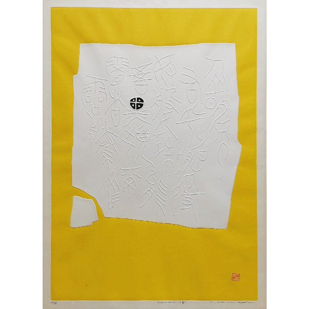
Flower Song: 1967. A series of ten images taking inspiration from Maki’s Figure series and the kanji for woman - either taking the kanji itself or stroke elements to create images that are more delicate in manner. Maki introduces thinner, subtle strokes to reflect branches/twigs & their adorning buds (splashes). Subsequently, Flower Song is perhaps Maki’s reintroduction of calligraphy/seal script elements notable to early works of the late 1950’s - this time employing them in an evolved manner to reflect more elegant, gentle stroke forms amongst boundaries of deeper tones, colour, & compositional elements. The root of a design language, & perhaps the epitome of his self-referred to “Shōkeimoji” (Hieroglyphic) style common to both his proceeding Poem/kanji based work, yet also his relatively minimalistic & delicate pieces attributed to Festive Wine.
Moon Song: 1967. A titled series to include only one print. It is unclear whether Maki planned to expand upon the series. Nonetheless, an elegantly uninked, embossed, horse-shoe image accentuated with a central column of bead-like forms and single splash of colour. Rare.
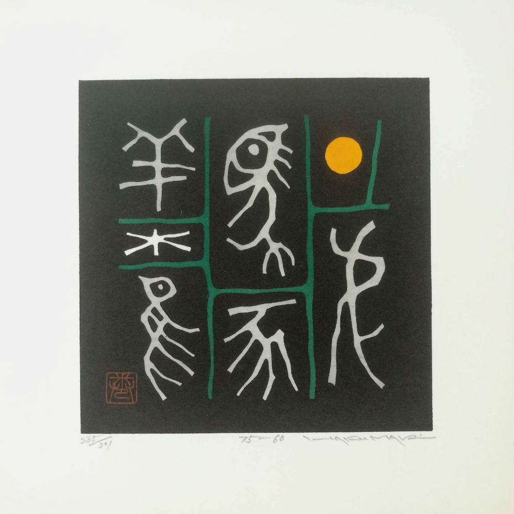
Animal Song/Zodiac: 1968. Officially titled Animal Song. Commissioned & sold by Kyoto based Red Lantern Gallery in 1968 - a series of twelve images, each an impression for every given year in the Chinese zodiac. Maki takes the kanji for each respective animal (Boar (亥), Dragon (辰), Snake (巳 ), Dog (戌), etc...) to produce maybe one of his most collectible series given its example to unify: his expression of fabulous colours notable to earlier “Big Red/Blue/Greens/Yellows”; compositional balance through “Splash”, seal, and “Sun” forms; and complex kanji/calligraphy elements, in a concise, limited, and concentrated body of work.
Poem A-Z: 1966/67. An important series of the complete roman alphabet A-Z which initially introduced Maki’s, arguably, most accomplished titled body of work, Poem. As Daniel Tretiak comments - a series which may have attracted Ann Brannen to Maki’s work (Refer to article on Festive Wine).
Maki’s prints through the late 1960’s to mid 1970’s focussed solely on developing images with Kanji/Chinese script as the principal element to his work. Printing with a well established & large visual library to reference from, prints had begun to evidence a repeating affinity for particular kanji - characters such as Woman, Child, Ox, Stone, and Man. Consequently, compositions common to Emanation, Figure, & Flower Song for example, naturally served as predecessors/inspiration for differing veins of successful work - immediately inspiring work on Festive Wine in 1968 & the core of his Poem & Work pieces thereafter, until the introduction his Persimmon & Collection series.
PRINTS POST FESTIVE WINE - MAKI IN HIS PRIME.
FESTIVE WINE. 1968/69. ARTICLE: HAKU MAKI, ANN BRANNEN, & FESTIVE WINE: ANCIENT JAPANESE POEMS FROM THE KINKAFU.
Refining Maki’s work from its more abstract roots, Festive Wine helped consolidate upon Maki’s use of kanji/early Chinese seal script as his central design theme. Its success helped inspire him to produce some of his most compelling, successful, & sought-after works through the early to mid 1970’s.
Poem: 1967-1972. The headline series to both Maki’s beautifully balanced calligraphy/kanji design compositions, and possibly, the headline series to his entire career. Prints illustrate elegant kanji/stroke forms amongst boundaries of deeper tones, rich colour &, compositional elements - the epitome of a matured and his self-referred to “Shōkeimoji” (Hieroglyphic) style. It’s success served as further vindication for his rising fame post Festive Wine’s acclaim.
Dance: 1969. Sharp, bright, and fabulously textured designs with strokes that sweep across the print conveying energy, movement and a sense of figures dancing.
Work: 1973-1975. Resuming after Festive Wine, Maki developed the series further from the initially more standalone titles of the late 1950’s. Employing a brasher hand, with larger and broader strokes to construct the kanji; elements often lead from the image edge and impose on a greater volume of the composition. An intriguing body of work, with hints of geometric forms, illustrating Maki’s subtly evolving approach when viewed juxtaposition to Poem’s typically more delicate, simpler pieces.
Haniwa: Early-Mid 1970’s. A unique design theme depicting clay, terracotta objects (typically figurines of animals, people, & simple shape forms) which adorned burial mounds to accompany the deceased. Typical through the Kofun (250-528) & Asuka (538-710) (collectively Yamato (250-710)) periods of ancient Japan. Limited designs each year.
San Mon Ban: 1975. A seven volume series (I-VII): each volume included a collection of twelve attributed prints. 2”x2” woodblock images, each volume carried particular themes of work: either taking inspiration from his previously successful designs; exploring new subject ideas around leaves, flowers, insects, trees, and fruits for example; or serving as a basis to further develop his initial, coming, ceramic & persimmon ideas. Volumes were published in two runs: an initial 200 prior to a further 165.
Months: 1976/77. Utilizing katakana characters as opposed to his typical kanji, Maki created pieces depicting script for each of the lunar months - complementing his compositions with black & white geometric pattern. (Maki developed a second series in 1998 where designs possibly took inspiration from his Hanto/Wan series designs).
LATER LIFE: 1970’S ONWARD & NEW DESIGN PILLARS.
The mid-late 1970’s saw Maki’s work shift away from kanji as his central design theme. Notably, from San Mon Ban onward, Maki began to explore further mediums and design styles (briefly emulating artists such as Toko Shinoda, Joichi Hoshi, and Tanaka Ryohei) as he sought to pursue print ideas that expanded outside of his previously reliable & well received themes.
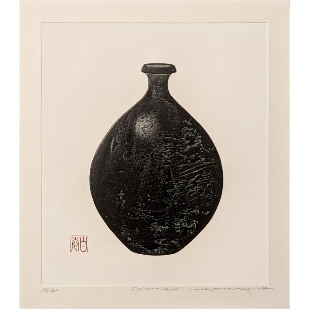
Seizing inspiration from his other passions: ceramics & pottery, Maki began to forge new distinct pillars of work in his Persimmon and Collection pieces. Together with his kanji based design themes, they have largely become Maki’s most identifiable and sought-after bodies of work today.
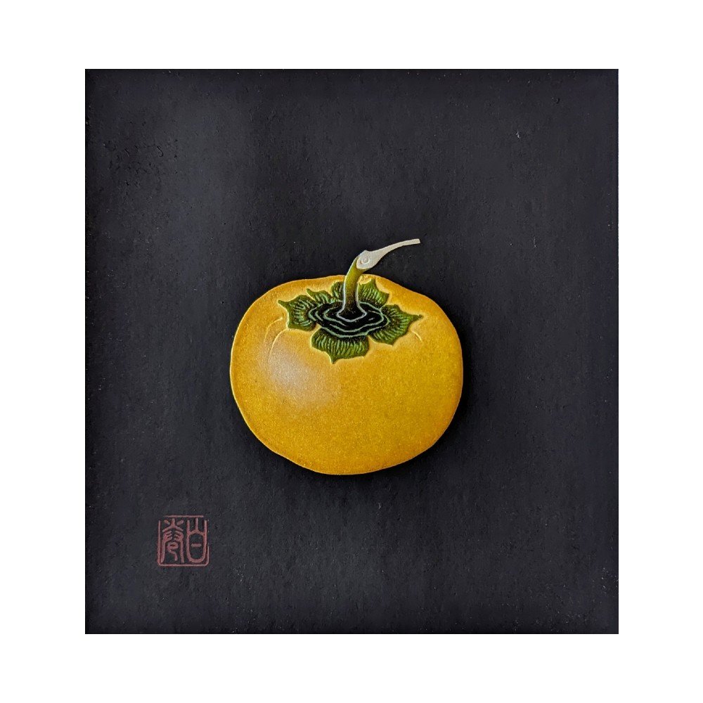
Persimmons: 1971-1981. A beloved autumn fruit; Maki takes the persimmon (kaki 柿), to produce elegant, pure, hand embossed compositions. Adorning elements with urushi lacquer and printing against starkly contrasting black - occasionally white - backgrounds, Maki’s Persimmon pieces elicit a particular premium feel to his pieces. With evidence to suggest Maki book-ended the theme with exclusive prints produced in 1971 & 1981 to include further refined leathered/velvet black backgrounds, Maki’s Persimmon prints typically attract greater market values.
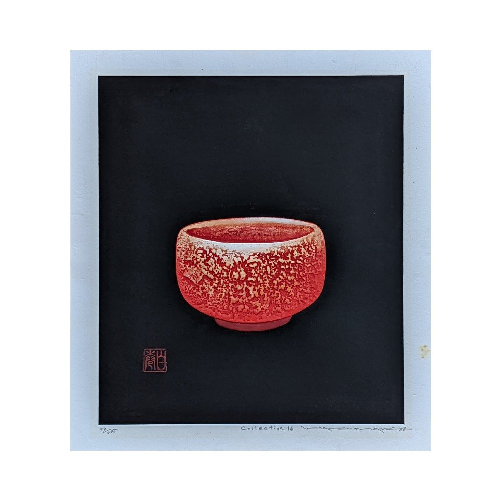
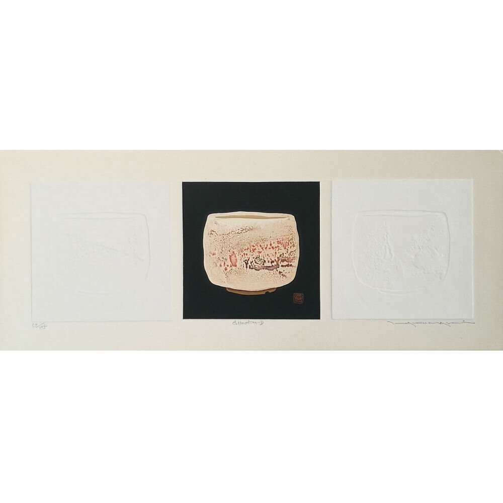
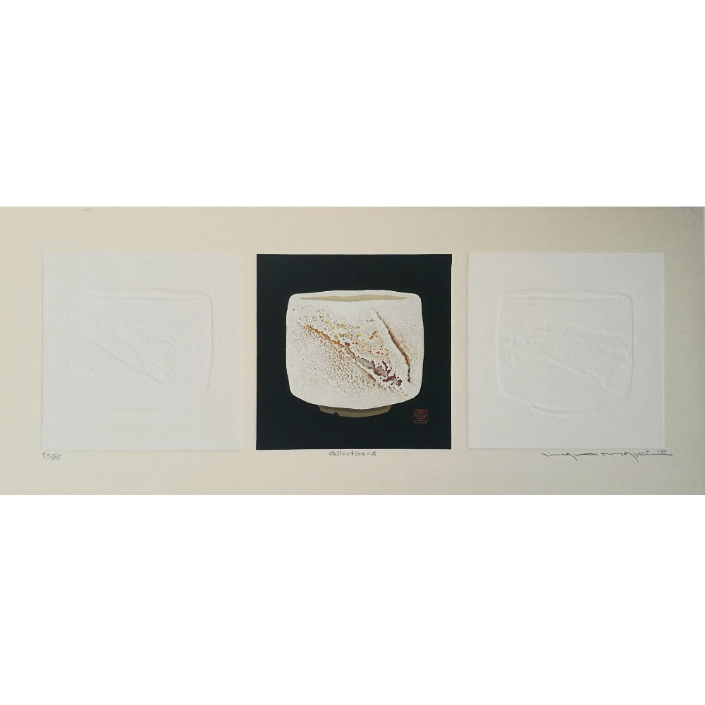
Collection: 1977-Late 1980’s. An elaborately coloured, embossed, and textured series conveying the simple beauty of traditional Japanese chawan, tokkuri, & gui vessels. Maki’s printmaking and series of prints during this period arguably display Maki’s sharpest use & mastery of texture and colour - clearly reflecting the tactile elegance of these cultural items. Kanji designs and compositional “splashes” concluded - however images are occasionally adorned with kanji strokes and additional seals as a means to offer description and achieve balance in his composition. Maki’s ceramic & pottery prints were produced across two periods:
1977-1980: Entitled Collection and titled in simple series/alphabetically.
1983-Late 1980’s: Continued the series together with varying sub-themed runs entitled Tokkuri & Gui for example, following intermittent years of believed poor health. Prints returned to Maki’s numbering/catalogue system as typical to previous work.
Through the late 1980’s and 1990’s Maki continued his ceramic theme, producing further runs entitled Hanto & Wan. However, they were typically produced as a collage. Living with an altogether declining health, Maki’s work adopted this methodology - reducing his use of embossing and returning to woodblocks & silkscreen mediums in an attempt to ease the production process’ physical toll, and meet an ever increasing demand for his work.
Consequently, as Maki entered the last decade of his life, he began to increase his edition sizes, with runs as common as 777 ((lucky 777?) though it is questionable whether Maki actually ran the full numbers). Furthermore, he began to repeat successful kanji themes/earlier works in an attempt to allow as many people as possible the opportunity to acquire an iconic Maki print. Well aware of his deteriorating health, Maki also began to metaphorically allude to his coming end - both topically in his designs & through his “Z” entitled print runs.
Fuji: 1989/90 onward. A series of Mt.Fuji images. Sharp, unembossed images depicting Fuji-san in differing tones of colour. Mixed edition sizes.
Go: 1993. Abstract designs based upon a 19x19 grid of the ancient Chinese board game Weiqi - now commonly & internationally known as Go (碁). Likely printed from the same block - each impression of the Go-1 & Go-2 runs were either matched with differing inks or rotated in pattern 90 degrees counterclockwise as of the last (Go-2 (A-D)).
Z-Series: A relatively large series to include photographic imagery/collages of fruits & vegetables. Closely run alongside Hanto, Wan, and Maki’s second 1998 Months series during the period.
Sailboats/Work-Z: 1999. Believed to be Haku Maki’s last prints and another example of his subtle, lighthearted, yet meaningful metaphors toward his nearing death. Sailboats depicted through lovely, almost sumi-like style woodblocks.
Maki passed away in 2000. The quantity of his work is ultimately vast and despite the relatively little contact with his contemporaries, he became internationally acclaimed - with work spread through galleries, museums, and private collections worldwide. Close friendships supported & promoted his work - particularly from dealers & collectors in North America - and Maki’s family assisted him at home, with the aid of his wife Maejima (Umeno) Takako, whom he married in 1954; Rie Ohtomo, his niece who supported his printing up until the 1980’s; local residents to his often relocating home; and a close student in Toru Matsui.
WITH A GREAT DEBT TO DANIEL TRETIAK, THE AUTHOR OF: THE LIFE AND WORKS OF HAKU MAKI.
WRITTEN BY: JACK PAYNE | © LAMBSQUAY GALLERY
Bibliography/Articles:
Blakemore, F. (1983) Whos who in modern Japanese prints. New York, Tokyo, Weatherhill.
Brannen, N.S. (1968) The Kinkafu Collection of Ancient Japanese Songs. Monumenta Nipponica. [Online] 23 (3/4), 229–273. Available from: doi:10.2307/2383494 [Accessed: 30 November 2018].
Cartwright, M. (2020) Haniwa. [Online]. Ancient History Encyclopedia. Available from: https://www.ancient.eu/Haniwa/ [Accessed: 30 January 2020].
Chua, L., Hoevel, C. & Smith, G.D. (2016) Characterization of Haku Maki prints from the “Poem” series using light-based techniques. Heritage Science. [Online] 4 (1). Available from: doi:10.1186/s40494-016-0096-z.
Koller, C. (n.d.) The artistic themes of Haku Maki in images. [Online]. The Koller Collection of Asian Art. Available from: https://www.asianartscollection.com/id/The-artistic-themes-of-Haku-Maki-in-images/14 [Accessed: 30 January 2020].
Petit, G., Sadajiro, K. & Hayter, S.W. (1973) 44 Modern japanese print artists. Tokyo, Kodansha International.
Smith, L. (2002) Japanese prints during the allied occupation, 1945-1952: Onchi Kōshirō, Ernt Hacker and the First Thursday Society. Chicago, IL, Art Media Resources.
Tretiak, D. (n.d.) Haku Maki Catalogue Raisonné. [Online]. Haku Maki. Available from: http://haku-maki.com [Accessed: 6 November 2018].
Tretiak, D. (2007) The life and works of Haku Maki. Denver, CO, Outskirts Press.
Tretiak, D. (© 2018) [Online]. The Tretiak Collection. Available from: https://www.trocadero.com/stores/tretslbj/
Tretiak, D. (© 2018) [Online]. The Tretiak Collection - Haku Maki Research Note. (Flower Song
Tretiak, D. (2013) [Online]. The Tretiak Collection - Haku Maki Research Note. (Animal Song).
Craft, R. (2015) [Online]. The Tretiak Collection - Haku Maki Guest Note 2. (How Maki Made Prints).
Tretiak, D. (2009) [Online]. The Tretiak Collection - Haku Maki Research Note 4.
Craft, R. (Oct 2017) [Online]. The Tretiak Collection - Haku Maki Guest Research Note 4. (Haku Maki’s Use of Seal Script).
Tretiak, D. (2012) [Online]. The Tretiak Collection - Haku Maki Research Note 8. (Persimmons Velvet 1981).
Tretiak, D. (© 2018) [Online]. The Tretiak Collection - Haku Maki Research Note 9. (Sailboats).
Tretiak, D. (May 2013) [Online]. The Tretiak Collection - Haku Maki Research Note 10 II.
Tretiak, D. (2013) [Online]. The Tretiak Collection - Haku Maki Research Note 12. (Maki’s series from 1965-1970).
Tretiak, D. (2014) [Online]. The Tretiak Collection - Haku Maki Research Note 17. Newly Found Haku Maki Prints 1968-1980.
Tretiak, D. (2015) [Online].The Tretiak Collection - Haku Maki Research Note 21.
Craft, R. Tretiak, D. (2016) [Online]. The Tretiak Collection - Haku Maki Research Note 23-1. (Haku Maki Back to the Beginning).